Using Data to Better Understand & Improve Your User Onboarding Flow
October 23, 2018
Most companies will tell you how important onboarding is and that it is one of their top priorities on any given year. However, these same companies struggle to improve their current onboarding performance. One of the major limitations for companies is the lack of data and insights. In fact, in the “2018 SaaS User Adoption & Onboarding Benchmarking” report, “48% [of companies] rely solely on informal calls with customers” to figure out sticking points and issues.
If I had to guess, companies already have lots of ideas on how to improve their onboarding flow, but they don’t have the right data to prioritize and execute on those ideas.
Before we go further, let’s properly define onboarding. Appcues defines onboarding as, “Activation [onboarding] takes place when users first achieve the value you promised.” This can happen over a few minutes, hours, or days (or even longer).
Your product might also have special pages or screens dedicated to just onboarding or perhaps you use tooltips/guides to tell users where to go. Either way, we’ll work on properly measuring these crucial first few steps.
The steps that we take to instrument our data are part of our D.I.G. methodology – it stands for Discover, Implement and Grow. For the onboarding tracking, these are the broad steps:
- Create the right reports that we need to be able to generate fairly quickly.
- Establish a baseline performance for your existing funnel.
- Find and prioritize areas of improvement.
- Deploy tests and track these experiments within your data.
Basic Reports to Measure Your Onboarding Funnel
The end goal for your reporting should be a funnel report where you can clearly see drop-offs along your onboarding steps. It looks something like this:
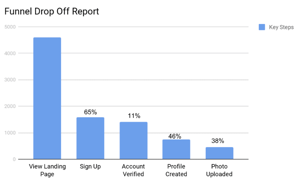
This might seem pretty basic, but I constantly come across companies who aren’t able to generate this report. You can easily create this report using popular tools like Mixpanel, Amplitude or you could generate it using a visualization tool like MODE or Tableau.
This funnel gives you an overall conversion rate for your funnel, but it won’t be helpful in your analysis. This funnel then needs to be sliced to find interesting segments to focus on. Let’s imagine that we want to see the onboarding performance by marketing channel (last touch to keep things simple). You would end up with a table like this:
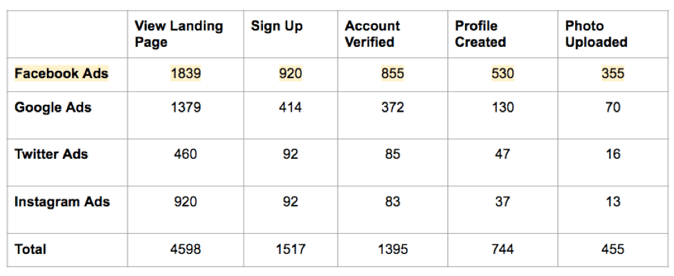
In this example, users who come from Facebook Ads tend to have a higher conversion rate than users from Google Ads. You can now start to investigate why these two marketing campaigns differ.
There are also other segmentation options that you can explore such as:
-
-
- Geographic (city, region, country)
- Demographic (age, gender, browser, device)
- Marketing Attribution (campaigns, sources, ads)
- Behavioral (specific attributes to your product like account authentication type (Facebook/Google) or pricing plan)
-
Determine the most important segmentation channels for your product and start tracking them within your data.
Finally, don’t always assume that the highest conversion rate segment is the one you should focus on. It is common to see high conversion rates across segments with very little data. Instead, ignore any segments that don’t have at least a few hundred conversions along the relevant step.
Establish a Baseline of Your Current Onboarding Performance
To establish a baseline, let’s run through a critical few questions.
Is the data accurate? How do we know?
Before you make any decisions, you need to ensure that your data is accurate. The best way to confirm this by comparing two data sources such as your analytics tool and your product database.
What is the average conversion rate?
This is the high-level conversion rate across the entire funnel and across individual steps. You also want to see how these numbers change across weekends and other seasonal changes in your business. This means that you will likely need at least a couple of months of data to feel confident in your numbers.
How long does it take to complete the flow and how do conversions change if we make the window smaller/larger?
Most analytics tools let you play around with the window of conversion and give you options like 30 days, 1 day, 1 hour, 5 minutes, etc. Play around with these windows and see how the conversion rate changes.
You also want to understand how quickly your best users are completing the funnel. This may be different from the average which could be weighed down by a minority of users who took a long time to onboard.
Are users skipping steps or returning to the previous steps?
This question starts to add complexity to our simple funnel report from the previous section but you want to see how many users are going back to previous steps or skipping them altogether. These answers can give you clues on what steps you need to modify or remove altogether.
How does conversion differ across common segments:
-
-
- Location
- Device (mobile vs desktop)
- Marketing campaigns
- Important behavioral and product features.
-
There are common segments that apply to nearly all products. Cover your bases and get the data to see the performance across these segments.
How do our best users perform or what is the ideal performance?
We can now build on one of our answers from question 3 and start looking at how the best users are going through the funnel. This can help us design the ideal experience in terms of performance.
Finding Areas to Improve Through Data
As you assessed your baseline analysis, you came up with clear issues that you should tackle. As I mentioned in the beginning, your team likely already has tons of ideas around what to improve, so you need help prioritizing how to tackle all of these ideas.
Here is how we typically recommend clients prioritize their ideas and what data to use to confirm if this is a problem for your company.
Technical issues
Solve any technical issues affecting performance. This can be browser specific issues with your product or perhaps device specific (mobile). Look for any discrepancies in conversion rate between browsers or devices to confirm technical issues (e.g. Chrome converts at a lower rate than Firefox).
Mobile vs Desktop issues
If a user can onboard on desktop or mobile, you might see conversion rate issues due to the differences in user experience.
Ensuring all the steps are logical and there is a reasoning behind each one
Double check that all of your onboarding steps are logical and that you have a clear and valid reason for each step. It is common to see onboarding flows where the company assumes that something is normal but most users find it weird like asking for a phone number where the product doesn’t need it.
Designing custom screens/pages for onboarding
If you don’t have a custom onboarding flow within your app, this can be the chance to build it. This can let you design exactly what the pages/screen should say and remove any distractions.
Removing commitment filters
Commitment filters are steps where users have to commit before continuing forward. Examples include asking for credit cards, identification, phone numbers, etc. A typical example here is to stop asking for a credit card before providing a free trial. However, keep in mind that some of these filters lower conversion rate but they tend to correlate with higher long-term metrics like retention and revenue.
Optimizing traffic sources
Finally, you can work on optimizing your traffic sources, which means removing any traffic sources with low-quality conversions and doubling down on the high-quality traffic. I include this last since this is typically the responsibility of the marketing team while the onboarding improvements are typically the responsibility of the product team.
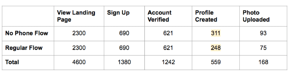
Tracking Onboarding Experiments Within Your Data
How you deploy your experiments will vary, but the tracking of it will be pretty consistent. Your data will consist of two things: events (actions) and user attributes. These two concepts are present in most analytics tools.
You then want to store experiment data within the events corresponding to the onboarding and user attributes. An event might look like this:
-
-
- Account verified:
- Verification Type: Email
- A/B Experiment: 5782
- A/B Experiment Name: No Phone Flow
- Account verified:
-
We end up storing the experiment information as event properties. We can then do the same as user attributes:
-
-
- A/B Experiments: 5782,8690, 8970, 9102
- A/B Experiment Name: No Phone Flow, No Credit Card Flow, No Verification Flow
-
You’re essentially creating new segments to slice your funnel report from the first section.
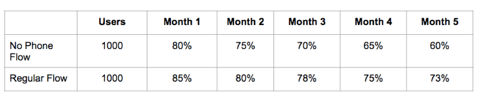
Tracking your experiment data will also let you understand the long-term impact of changes. You could segment your users into a cohort analysis report to understand how retention was impacted.
The overall process for measuring your onboarding funnel is straightforward, but it takes time to get everything right. Start small and slowly build up over time. Eventually, you can have a clear understanding of your current performance and how changes are impacting metrics such as retention and churn.